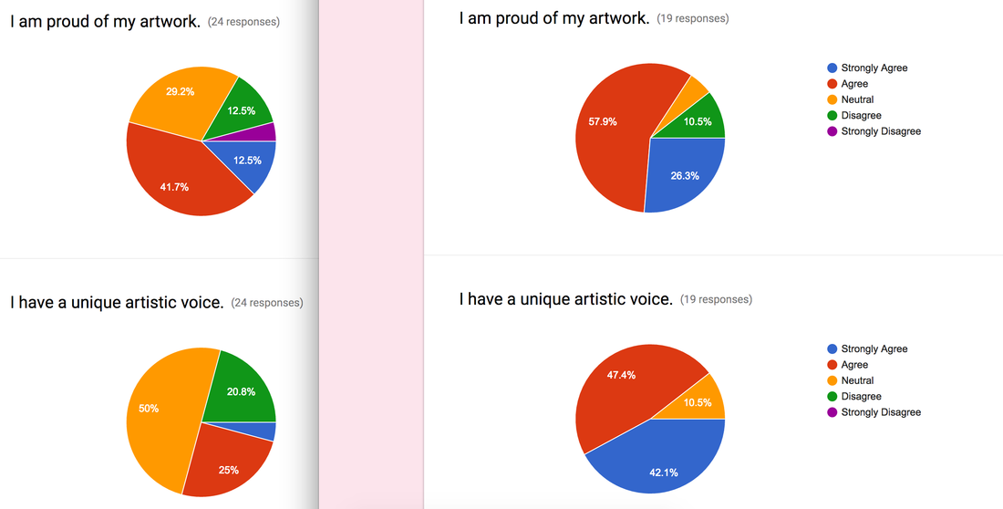
 Figure 32. Comparison of student responses. Pre and Post-Instruction survey.This is a comparison image from my paper. I think it shows the most how much growth my students felt over the semester.
1 Comment
Wendy Miller
3/7/2017 03:44:13 pm
I think this does show (to some extent) that your students feel they are more able to share their artistic voice. But numbers don't really show me that they have a unique voice. I think the interviews, the portfolios and the conversations you had were stronger. I think for sake of triangulation that this data (pie charts) can be used as one of the forms, but not the strongest. Qualitative data uses the students' voice, their artwork, and their own actions to complete this. Leave a Reply. |
AuthorMorgan Singleton is a secondary art educator with a Master's degree in art education. Archives
April 2017
Categories
All
|
 RSS Feed
